• Home
  • About me/Chi sono
  • Contact

Un po' di pepe

~ …… (oon∙poh∙dee∙PEH∙peh) Cristina writes about interesting stuff /Cristina scrive di cose interessanti

Un po' di pepe

Tag Archives: Art materials

Countering Isolation with Creativity

15 Wednesday Mar 2023

Posted by Un po' di pepe in Art, Art projects

≈ 9 Comments

Tags

Accenti magazine, Art history, Art materials, autoritratto, Selfie

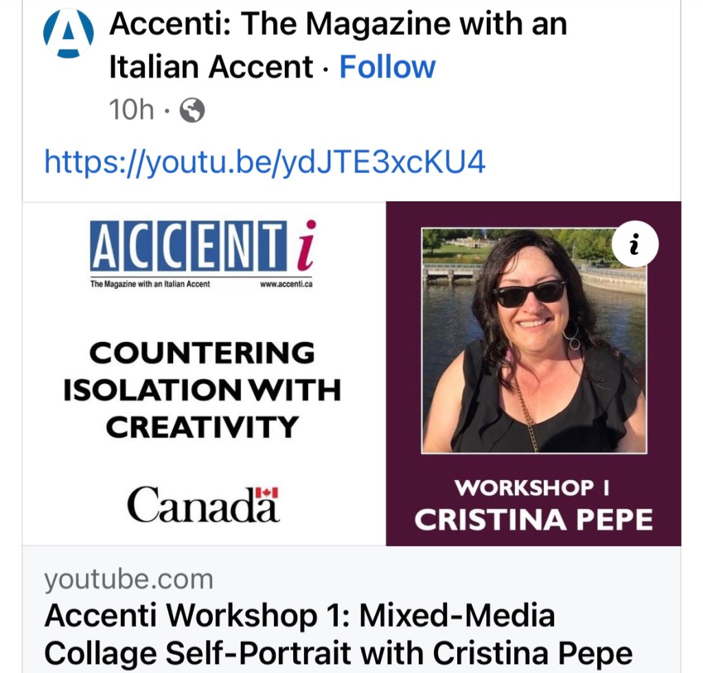
Countering Isolation with Creativity was a Canadian government incentive to engage Canadian seniors post COVID. Accenti Magazine received a grant to host 12 free workshops via Zoom for those over 55.  I had the pleasure of presenting the first workshop May and here it is on Youtube!  I had to figure out how to use 2 cameras so I could talk and also demonstrate.  There was an email sent out to participants in advance with the preparation work.  I am including the information after the video, if anyone is interested.  


Countering Isolation with Creativity: Accenti Magazine Workshops to engage Canadian seniors. Mixed Media Collage Self-Portrait Workshop

Who says ‘selfies’ can only be by phone? Try this mixed-media collage project to make your own selfie at home. In this 90 minute workshop, participants will create a mixed media collage self-portrait.  There is some image gathering and/or preparation work to do in advance. 

Instructions for Workshop preparation and supplies:

For the workshop, you will need 3 self-portrait images.  They can all be the same image, which you will each colour differently, or 3 completely different images.  If you prefer to use a photograph, it is best to use a larger size (5×7 or 8×10). These images can also be prepared during the workshop if you like, but there will probably not be enough time to complete the project. 

To make a self-portrait, use a hand mirror or wall mirror and draw yourself.  Angle the mirror based on the profile you want to draw.  It can be a frontal view, side view, even a view from above if you have ceiling mirrors.  Try to keep the drawing surface as vertical as possible and draw what you see.  Sketch in the main shapes first, then add details and shading.  Put lots of ‘self’ into it.  Use props to express your personality.  If drawing yourself from a mirror is awkward, try drawing from a photo with a plain background. 

Use any media; pencil, pen, sharpie, felt, crayon, eyeliner, lipstick…. The images can be as simple or as complex as you like.  Representational images (meaning it actually looks human) or abstract images will work. 

Make 3 different portraits, or just one, then make 2 photocopies or tracings.  Colour 2 of them, so that you have 3 similar, but different portraits.  If you prefer to work with photographs, it is best if they are larger.  If you only have 1 photo to use, make 2 copies. 

Feel free to start several collages to work on simultaneously and continue after the workshop ends.

Supply List for the workshop:

  • Images; 3 self-portraits on paper, all a similar size
  • A hard surface to glue onto. This can be a wood panel or board, a heavy piece of cardboard or a piece of 250-300 lb paper.  A surface with something already on it works well, since there is already an underpainting!
  • Acrylic matte medium. Matte medium is acrylic paint without the colour. It can be used as a glue and also as a protective coating over top of your work.  White glue can also be used if you do not have matte medium, but it is not archival
  • Paint brush and/or foam brush
  • Scissors
  • Hand mirror (if you need to work on your images)
  • Whatever art supplies you have-anything goes! Ex: acrylic or watercolour paints, pencil crayons, markers, oil or chalk pastels, inks, stencils
  • Bits and pieces of old artwork or fancy paper to collage, magazine clippings, letters, postage stamps, blank or printed rice paper or tissue paper, photos, paper doilies, candy wrappers…..more stuff is better!  

Happy Creating!  If anyone makes a selfie collage, let me know!  Ciao, Cristina


Share this:

  • Facebook
  • Pinterest
  • Twitter
  • Email
  • WhatsApp

Like this:

Like Loading...

Chiacchiere

01 Sunday Feb 2015

Posted by Un po' di pepe in Art projects, Italian language, Parole piacevoli

≈ 14 Comments

Tags

Art, Art materials, Chiacchiere, Crustoli, Italian language, Italian pronunciation guide, Painting

Chiacchierare (kee•ak•kee•eh•RAH•reh) is what I like to call a ‘parola piacevole’ (pa•ROH•la pyah•cheh•VOH•leh)-a likeable word. I love how it sounds.  If you need to review Italian pronunciation go back to this post.  The verb chiacchierare means to chat or talk.  It can also mean to gossip or make small talk. ‘Facciamo due chiacchiere’ literally means ‘Let’s have a few chats’.  Chiacchiere is also one of the many names for fried pastry for Carnevale.

Chiacchiere, 2014

Chiacchiere, 2014

I titled my quick monochromatic acrylic sketch on paper ‘Chiacchiere’ because as soon as I finished it that is the word that came to me.  I wonder what these two vecchiette (vek•KYET•teh =little old ladies) are talking about today? I might turn them into a real painting or some note cards…so I can write down my chiacchiere and send them to you!

Share this:

  • Facebook
  • Pinterest
  • Twitter
  • Email
  • WhatsApp

Like this:

Like Loading...

Nel Blu Dipinto di Azzurro-A History of the Colour Blue

23 Sunday Nov 2014

Posted by Un po' di pepe in Art, Art history

≈ 4 Comments

Tags

Art history, Art materials, Azurite, Botticelli, Cennini, Giotto, Lapis lazuli, Marco Polo, Painting, Ultramarine blue, Vermeer

PoggipoggiazzurroThis post is not about Domenico Modugno’s 1958 hit song or the Azzurri, the Italian national team.  It is about the long and fascinating history of blue pigment.  Although the colour blue is all around us-in the sky, the sea and the mountains, blue pigment is rare in nature.  Unlike earth colours, which could be made by going outside and mixing dirt with oil or sap, blue pigment was made with ground minerals which were not easily obtained. This made blue a rare and valuable colour.

The Ancient Egyptians made a pigment called blue frit from blue glass ground into powder, but the complicated process of how to make it was lost. Historically, the most prized blue was ultramarine, a warm blue with a brilliant tone, leaning towards violet on the colour wheel.  Genuine ultramarine blue was made from ground lapis lazuli stone which has tiny specs of iron pyrite in it that make it glitter like gold.  Lapis lazuli comes mainly from one set of mines in the remote Badakhshan area of Northern Afghanistan (formerly Persia).  The Sar-i-Sang (Place of the Stones) mines have been in operation continuously for over 6,000 years!  Marco Polo explored the area in the 13th Century and wrote ‘there is a mountain in that region where the finest azure (lapis lazuli) in the world is found.  It appears in veins like silver streaks’.  The name ultramarine does not refer to the colour of the sea. ‘Azzurro oltre mare’ or ‘azzurro oltremarino’ means ‘blue from across the seas’.  No one knew exactly where it came from or how it was made, giving it an exotic and mysterious aura.

Lapis lazuli from the Sar-i-Sang mines in Afghanistan, courtesy of Mountain Gems, Burnaby BC.

Lapis lazuli from the Sar-i-Sang mines in Afghanistan, courtesy of Mountain Gems, Burnaby BC.

Lapis lazuli was exported to all parts of the ancient world and used for jewellery and adornment.  It is mentioned in one of the oldest known works of literature, the Mesopotamian poem ‘The Epic of Gilgamesh’ (17-18 C BC).  The irises on the Louvre’s 2400 BC alabaster statue of Ebih-II from ancient Mari (modern Syria) are made of lapis lazuli as are the eyebrows of the funeral mask of King Tutankhamun (1341-1323 BC).  Cleopatra may have even used very finely powdered lapis lazuli for eyeshadow.  Try finding that at Sephora!

The process for making a permanent, non-toxic pigment by extracting colour from the lapis lazuli stone was developed in 12th century Persia.  Trade of ultramarine to Europe via Venezia started soon after Marco Polo’s time.  It was used for manuscript illuminations and painting.  In his early 15th century bestseller, ‘Il Libro dell’Arte’ Cennino Cennini writes about how to make the pigment.  Powdered lapis lazuli stone was sifted and mixed with pine resin, gum mastic and wax or linseed oil.  It was wrapped in cloth, soaked and kneaded with a dilute lye solution until the blue colour was extracted.  Cennini wrote ‘ultramarine blue is a color illustrious, beautiful, the most perfect, beyond all other colours; one could not say anything about it, or do anything with it, that its quality would not still surpass’.

Extracting colour from lapis lazuli with lye can be compared to pressing olive oil. The process is done 3 times.  The first ‘press’, like extra virgin olive oil produces the highest quality colour.  The second press, although still good, is a lower quality colour, and the final press would be the equivalent of pomace olive oil.  In the 2009 Australian/French documentary ‘Cracking the Colour Code’ Massimo Zecchi can be seen preparing genuine ultramarine pigment for the restoration of a Renaissance altarpiece.

During the Renaissance, ultramarine became associated with the divine and heavenly, giving works of art both a sense of spirituality and luxury.  Since it was worth more than the same weight in gold, it was used sparingly by Renaissance painters.  It was reserved for the most important parts of the painting-usually the robes of the Virgin Mary and baby Jesus.  Artists would sign contracts with their patrons stating the quality and price to be paid for the pigment.  Zecchi Colori e Belle Arti in Firenze has been making artist pigments for over 300 years. On their website 100g of ‘Azzurro oltremarino di lapis lazuli Afgano’ sells for 510 Euro, 10g is €58  2nd quality is €290 for 100g or €38 for 10g.

Artists often economized for the underpainting by using blue made with azurite, a mineral mined in France.  Then they would add thin layers of ultramarine over top.  Azurite makes a paler, greenish blue.  It was used for painting skies but would turn dark over time.  In one of my favourite paintings, Sandro Botticelli’s 1470  ‘La Madonna dell’ Eucaristia’ (the Madonna of the Eucharist), the difference between the grayed greenish blue of the sky and the brilliant ultramarine of the Madonna’s robe is clearly visible. If you are in Boston, be sure to visit this masterpiece at the Isabella Stewart Gardner Museum because photographs do not do it justice.

La Madonna dell' Eucaristia (1470) by Sandro Botticelli

La Madonna dell’ Eucaristia (1470) by Sandro Botticelli

Ultramarine was not used in fresco painting, as the colour bleaches out in reaction to the acidic wet lime plaster.  This meant an enormous amount of the expensive pigment would be needed.  Azurite was used for fresco painting.  It had a course texture, making it hard to stick to the plaster.  Several layers of azurite were needed, giving the fresco a crusty or chalky look. Ultramarine pigment was mixed with a binder-usually egg yolk, and applied to the fresco ‘secco’, after the plaster had dried. This is how Giotto painted the magnificent Cappella degli Scrovegni in Padova in 1305.

A small section of Giotto's Cappella degli Scrovegni

A small section of Giotto’s Cappella degli Scrovegni

The turban of Johannes Vermeer’s mesmerizing 1665 ‘Girl with a Pearl Earring’ is painted with a mixture of ultramarine and lead white, with many thin glazes of pure ultramarine painstakingly painted over it. Vermeer went into debt buying the pigment!

Girl with a Pearl Earring (1665) by Johannes Vermeer

Girl with a Pearl Earring (1665) by Johannes Vermeer

In the 18th Century, oxides from cobalt were used to make a blue similar to the Ancient Egyptian blue frit. Several other blue pigments were also developed, but none could compare to ultramarine.  In 1826, the French government offered a prize to produce a synthetic version of ultramarine. Many attempts failed. The final product was named ‘french ultramarine’.  Large quantities could be produced at a much lower price. This is the ultramarine blue pigment we use today.  It is one of the most important colour discoveries in the history of artist pigments.   The next time you crack open a tube of ultramarine blue, squeeze it onto your palette and load it on your brush….you can recall the long and fascinating history that led to the manufacture of your paint!

The Italian word for blue is azzurro (ahz·ZOOR·roh), from the Persian word lazhward which morphed into lazulo then became azzurro.  The same word is the root of English azure, French azur, Polish lazur, Romanian azuriu, Spanish and Portuguese azul, and Hungarian azúr.  Lapis is Latin for stone, thus lapis lazuli means blue stone.

Forza Azzurri!

Forza Azzurri!

©2014 http://www.unpodipepe.ca

Share this:

  • Facebook
  • Pinterest
  • Twitter
  • Email
  • WhatsApp

Like this:

Like Loading...

Il Torchio

25 Saturday Oct 2014

Posted by Un po' di pepe in Art, Inspiration

≈ 6 Comments

Tags

Art materials, Etching press, Inspiration, Printmaking, Torchio per incisione

My new torchio!

My new torchio!

Finalmente!  I finally have my etching press (torchio per incisione)!  It’s a Richeson 11 inch ‘Baby press’.  I’ve been waiting to buy this bambino for a long time.  During the 2010 Winter Olympics, I ‘accidentally’ rented out my guest room to a very nice couple of lawyers from Michigan.  I decided I would use the money to buy myself the Baby press from Daniel Smith in Seattle.  I knew 3 printmakers who had one so I knew that it was small but sturdy and very well-built. I made several attempts to get one in Seattle, but something always went wrong.  One time I called ahead to make sure they had one in the store, but by the time I arrived it had been sold, another time the only one available had a dent in the press bed, another time I got stuck in traffic and didn’t make it there before closing time, and when I went to see U2 in Seattle, I was with too many other people and it was out of our way.  Uffa! I thought I would never have my little torchio and be doomed to printing with a pasta machine!

I recently found out that a printmaker I know bought a bigger press, so I asked her if she wanted to sell her bambino.  She was apprehensive at first, but I assured her he would get a good home and lots of love.  She finally agreed to the adoption and yesterday I picked him up from her studio.  It only took me 4½ years to get my torchio!  I can’t wait to use it for monotipi, punta secca and xilografia (monotypes, dry point etching and wood cut).  Grazie Mitch, Ellen and Kari!

Share this:

  • Facebook
  • Pinterest
  • Twitter
  • Email
  • WhatsApp

Like this:

Like Loading...

Enter your email address to follow 'un po' di pepe' and receive notifications of new posts by email.

Join 472 other subscribers
Follow Un po' di pepe on WordPress.com

Popular Posts

  • Italiano per Ristoranti~How to pronounce your restaurant menu
    Italiano per Ristoranti~How to pronounce your restaurant menu
  • L'ultimo Caravaggio
    L'ultimo Caravaggio
  • ‘Il Gigante’- Michelangelo's David
    ‘Il Gigante’- Michelangelo's David
  • Polignano a Mare
    Polignano a Mare
  • Palazzo Massimo alle Terme, Roma
    Palazzo Massimo alle Terme, Roma
  • Limoncello Ricotta Cookies
    Limoncello Ricotta Cookies
  • L'arte sa nuotare
    L'arte sa nuotare

Recent Posts

  • Countering Isolation with Creativity
  • Gallerie d’Italia Napoli
  • Sanremo 2023
  • Appuntamento con la Daunia
  • Buon Anno 2023
  • Diamond Anniversary
  • Post Pandemic Travel Postcard
  • Un Matrimonio in Puglia
  • In my Kitchen in Puglia, 2022
  • Beat the heat: Surviving Summer in Roma
  • Ottavo Bloghiversario
  • 2 years of Covid-19
  • Giornata della Donna~Mariya Prymachenko
  • Festival di Sanremo
  • 2021~ Un po’ di pepe year in review
  • Italian Christmas Vocabulary
  • 100 years of Insulin
  • Italiese
  • Marostica~Partita a Scacchi
  • In my Kitchen-Summer 2021
  • Reflections from a COVID immunizer
  • Recent Successes for Italia
  • Internment of Italian Canadians
  • Settebello-Bloghiversario #7
  • Tiramisù

Categories

Amici e Famiglia Architecture Art Art history Art projects Bilingual posts Blogging Canada Culture Feste Firenze Inspiration Italia Italian Folklore Italian language Italian life Italocanadesi Libri Mangiamo! Orsara di Puglia Parole piacevoli Photography Puglia Recipes Roma Travel Travel tips Uncategorized Vino

Archives

Un po’ di pepe on Facebook

Un po’ di pepe on Facebook

Start a Blog at WordPress.com.

  • Follow Following
    • Un po' di pepe
    • Join 472 other followers
    • Already have a WordPress.com account? Log in now.
    • Un po' di pepe
    • Customize
    • Follow Following
    • Sign up
    • Log in
    • Report this content
    • View site in Reader
    • Manage subscriptions
    • Collapse this bar
 

Loading Comments...
 

    %d bloggers like this: